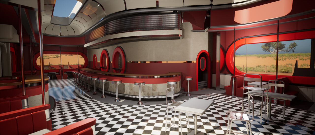
It has been a while since I did an update on this project. I picked it up again after a good break away. In that time, I have worked on an Artstation competition, a collab project and another personal project, so I don't feel too much art guilt.
I won't lie. It's a challenging project, but I am determined to finish this monster.
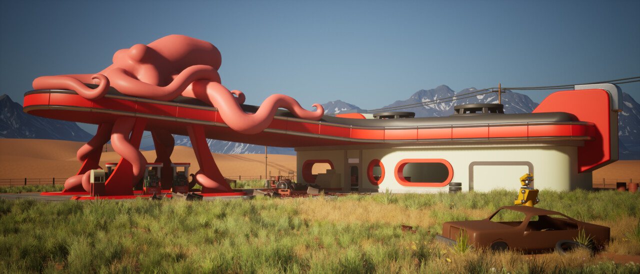
This is where we left off...
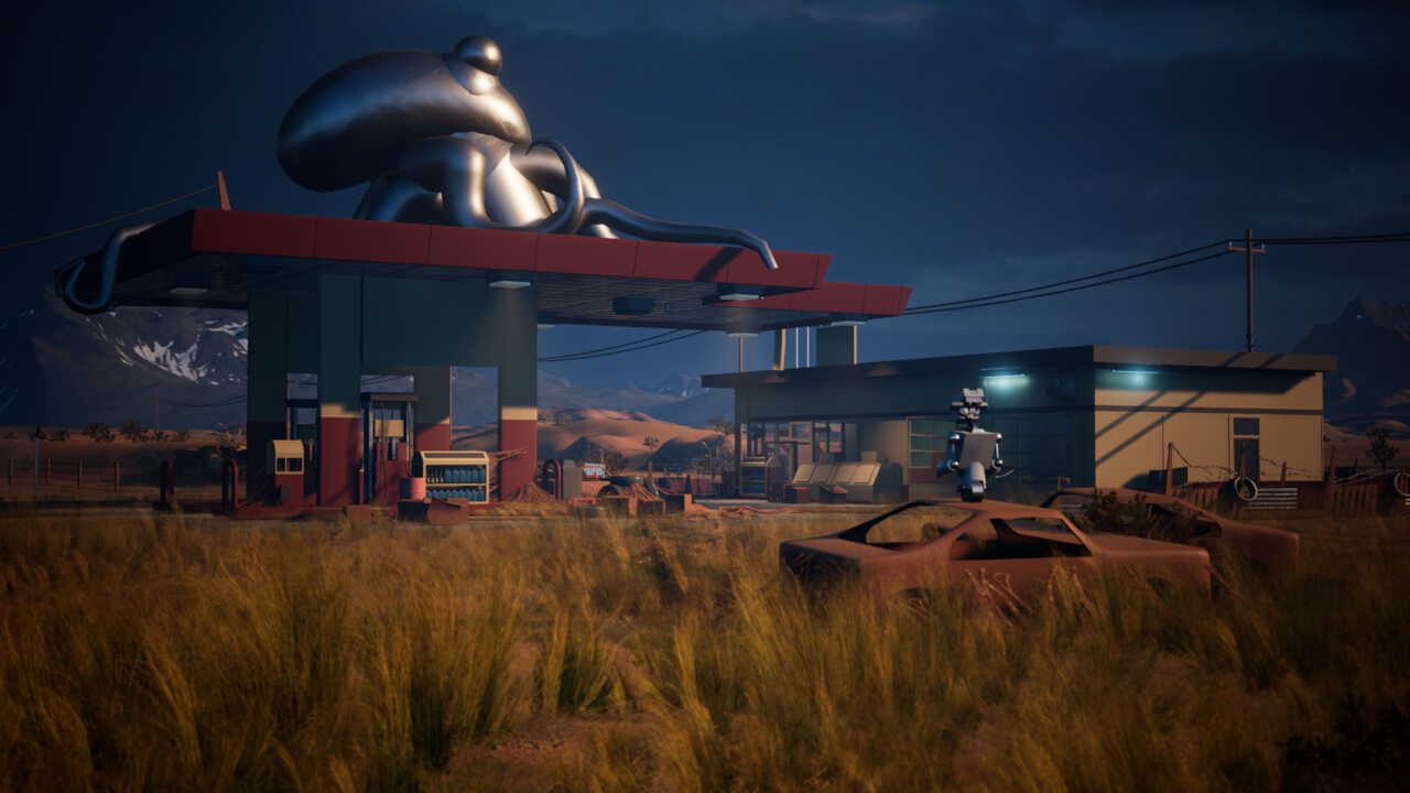
Since that, I have worked on foliage, grasses and bushes. I posted this as a separate project on Artstation and wrote a few articles detailing my learnings and process.
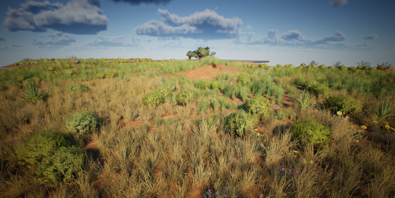
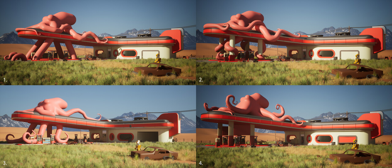
After the foliage, I tried to establish different times of day for the scene with a wider 21x9 shot. I knew I wanted to have four different setups. The primary rainy sunset mood from the concept, Sunrise/set golden hour, hot midday sun and either night/overcast style shot. Four shots together seemed to make sense to me for presentation purposes.
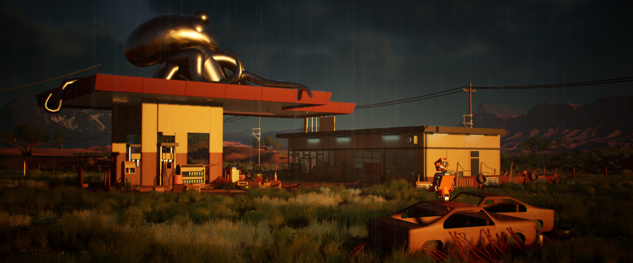
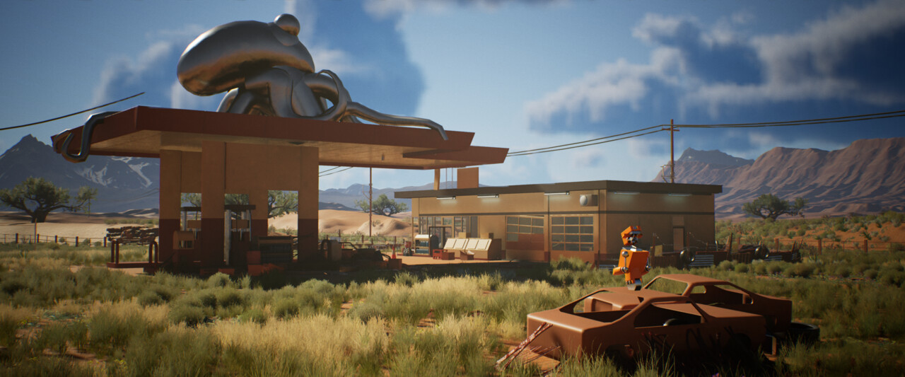
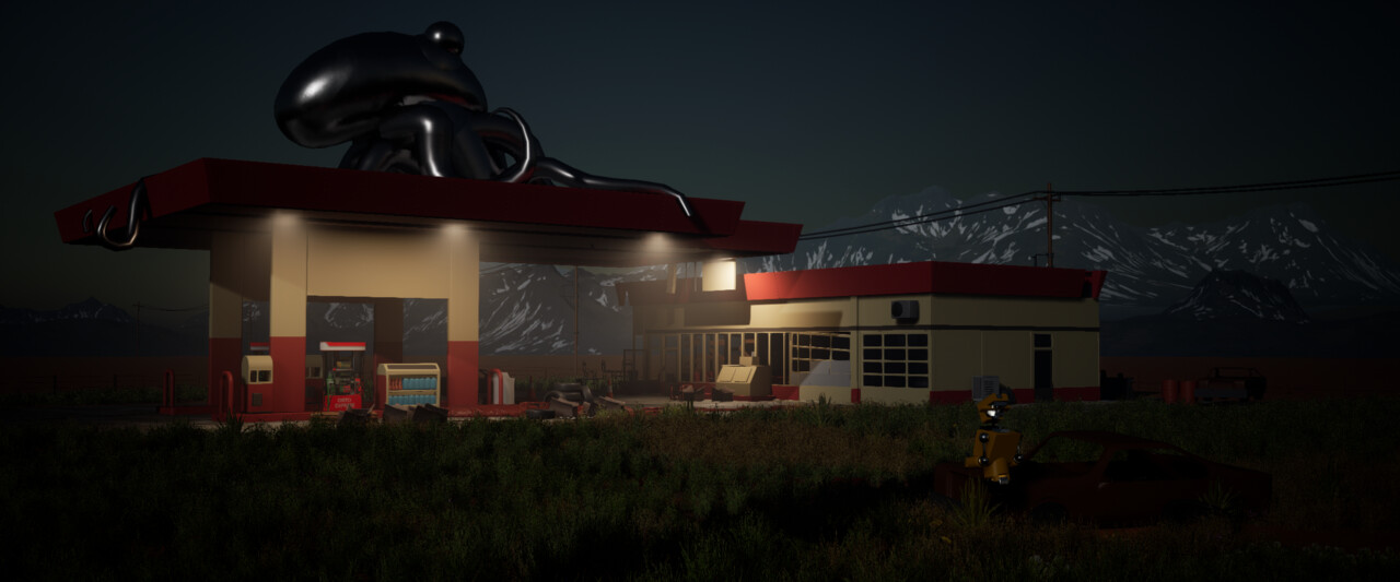
When I returned to it, I started looking at the destruction, trying to imagine what I could do to try and show a more abandoned setting. I wanted to get a damaged roof where it had partially collapsed, breaking down the top into modular pieces and creating a slight tilt to the roof itself.
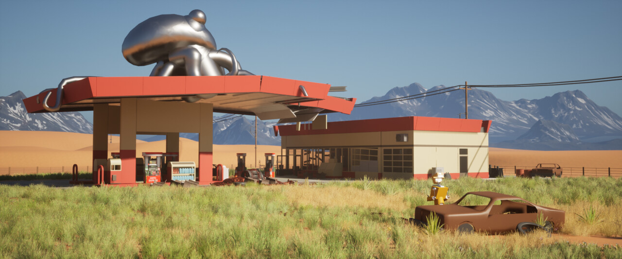
From here, I left the project alone and had a break to work on the other projects I mentioned above. I dipped in and out of the project for a while. Often I would have 2 or 3 projects on the go at once, so progress was slow during this period.
When I finally wrapped everything up and returned full-time without distractions, I knew I wanted to rework my gas station style. I wasn't happy with how square everything had become. In my art bible and style guide, I wanted all the props to feel rounded and bevelled, similar to some of the sci-fi designs you see in games like Wolfenstein or Fallout. Those games have always been a visual inspiration for me. I created a fallout-style project in the past. I looked at doing a pass to bevel and round out the shapes similar to those games. Fallout has an excellent gas station called the 'Red rocket' station.
I also thought it would be cool to implement the octopus into the gas station more.
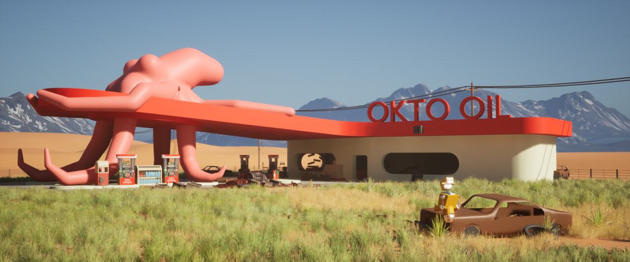
Below is the progress once I have fleshed things out a bit more.
At this stage, I also tried different arrangements for the octopus. I got some advice from friends about which designs were working best. I tried the octopus' tentacles forming the support pillars, wrapping around them, or isolated to the top.
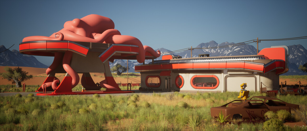
In this version, I had a connected roof which was a bit of a rip-off of the red rocket station; it felt too close to that design, so I decided to split it. The negative space worked better for my design, especially as the octopus on top is pretty heavy.
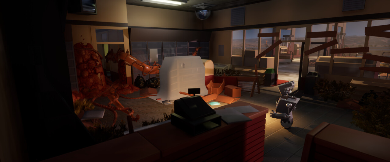
I also redid the interior. The interior was initially blocked out as a service shop for the gas station, but I felt the aesthetic was crying out for an old 50's style diner. So here is where I left it previously. I wanted to have it boarded up and overrun by infection. So the robot is inside exploring.
The theme is still the same. Overrun with infection (although this isn't in the shot yet), except now it will be an old diner instead. Here is the shape of the new blockout for the building
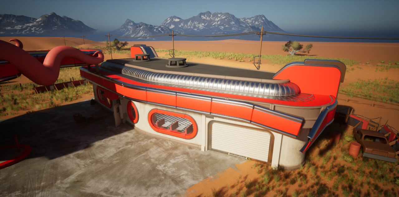
How the blockout was taking shape at this stage for the inside. I was also inspired by some of the forms inside Dex's diner from Attack of the Clones.
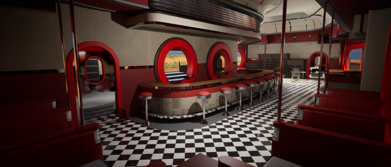
That wraps up much of the blockout; if you made it this far, thanks for reading. In future posts, I will show some of the progress on the interior creation and outside of the building, which is much closer to completion now.
The whole scene is much further along than these blockout shots, but I haven't been great at updating the blog.
Peace out
Ben
