After running several iterations of my CGMA Introduction to Substance course I thought it be good to try to write a blog aimed at Students and professionals learning Substance Designer. I wanted to detail the information that I teach every term and use this as a resource for people who are new to Substance. I hope that it is useful to a wide range of people and if it proves to be popular, I may do another more advanced one.
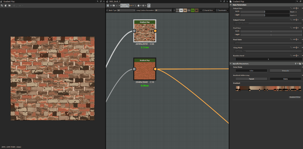
Using too many keys in gradient nodes
When people are starting out they use the gradient nodes sample gradient feature, it involves sampling an image to generate gradient keys. This is both a fun and practical feature but becomes a nightmare to edit later if it’s not correctly optimised. It's worth cleaning up the keys for refinement later. Plus alterations become near impossible with lots of keys. It's generally good practice when you get into a studio environment.
Greyscale and colour blending
It is good to stick to the general rule of using greyscale to create your height/roughness/metallic and colour for your diffuse and normal. It is not always 100% clear but often there are options in one node for both. You have either two versions of the same node or a switch, which alters between colour and greyscale. This is super important because it’s a lot cheaper to use greyscale. As you use certain nodes, you will see that it tries to convert between the two types if you use the wrong input. This is adding unnecessary nodes and makes no difference to the result so it’s worth identifying these issues.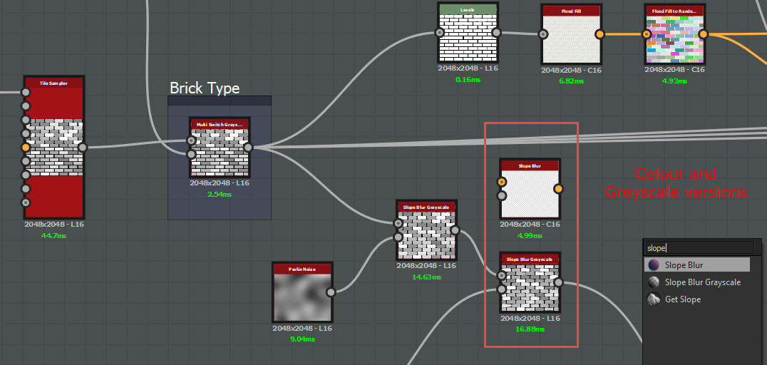
Different versions of the same nodes
 Converting greyscale to colour/red shaded line dictates colour when it expects greyscale.
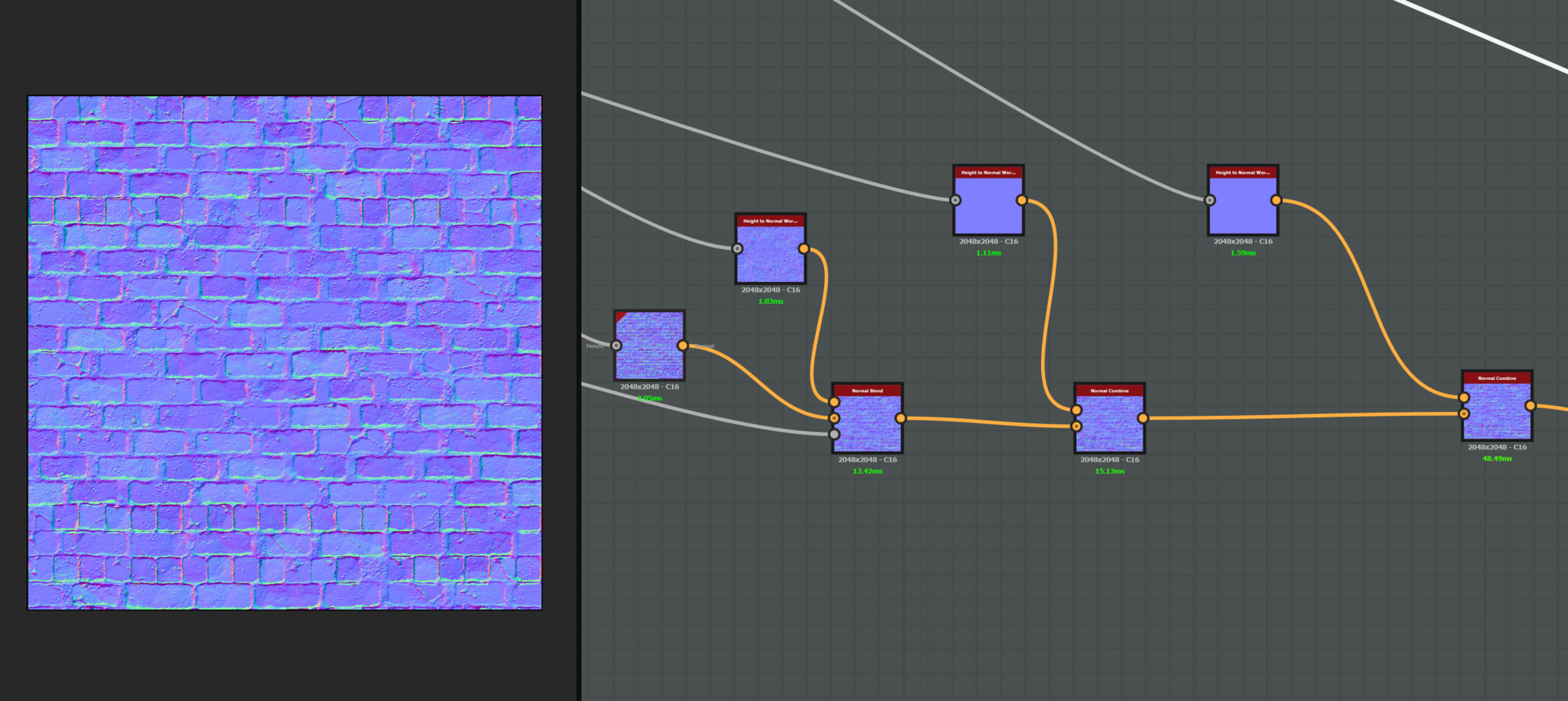
Blending together normal maps
Often beginners will try to blend multiple normal maps, which for the vast majority of cases makes no sense. It is better to focus on getting an excellent height map first. This will let you drive your other maps later down the line and blending multiple materials will be more successful. There are always exceptions to every rule and sometimes you will want to control your normal map separately to your height. Vegetation being a good example of this.
Macro to micro and grunge map
It’s always a good idea to focus on larger forms first and work your way through the varying scales of detail, this ensures for a compelling and well balanced material and helps you to tackle material definition. One mistake I see very often is using slope blurs with quite grungy maps very earlier on which makes for a noisy material. You tend to find you will lose the macro to micro detail. Getting finite granular detail is a great process to have in your materials but it should happen once the larger forms are established.
Example of Macro to Micro
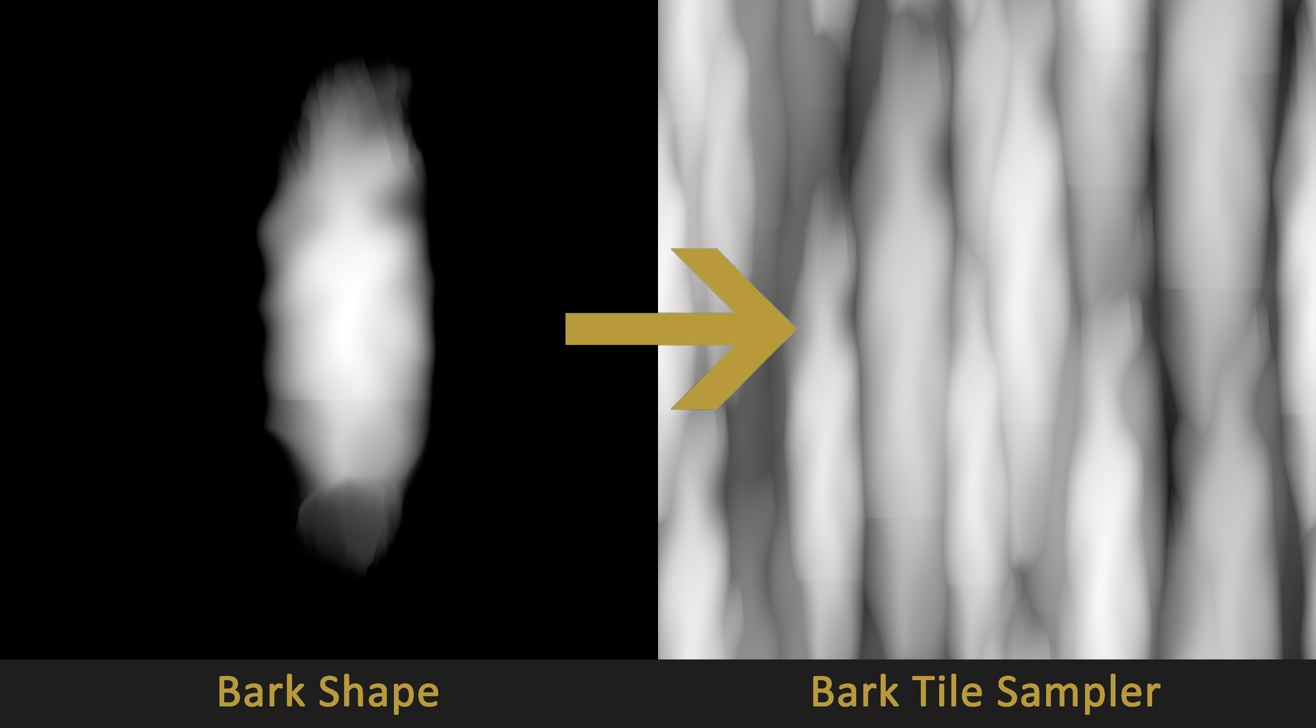
Relying on grunge maps to generate base shapes in a material
In the first week of the course, I set some simple patterns for students to create. One of which is a tree bark material. This is quite a complex pattern to create and naturally students look in the library to find the easiest and fastest result, which happens to be Grunge Map 005. It’s good to understand that while easy and fast is a great method, Designer's strength lies in iteration and procedural approaches. It’s better to break down the construction of the bark because as an artist that means you will have superior control later down the line. It's far more scalable and if needed you can create another type of bark in the future. Breaking it down means you have a great starting point to work from if you need another version in the future.

VS
Over warping
Often when I see artists starting out in Designer there is a tendency to over warp shapes. Warping is a great tool but it can blur pixels together if over warped. Extreme warping can look quite unnatural and give nasty results.
Incorrect PBR values
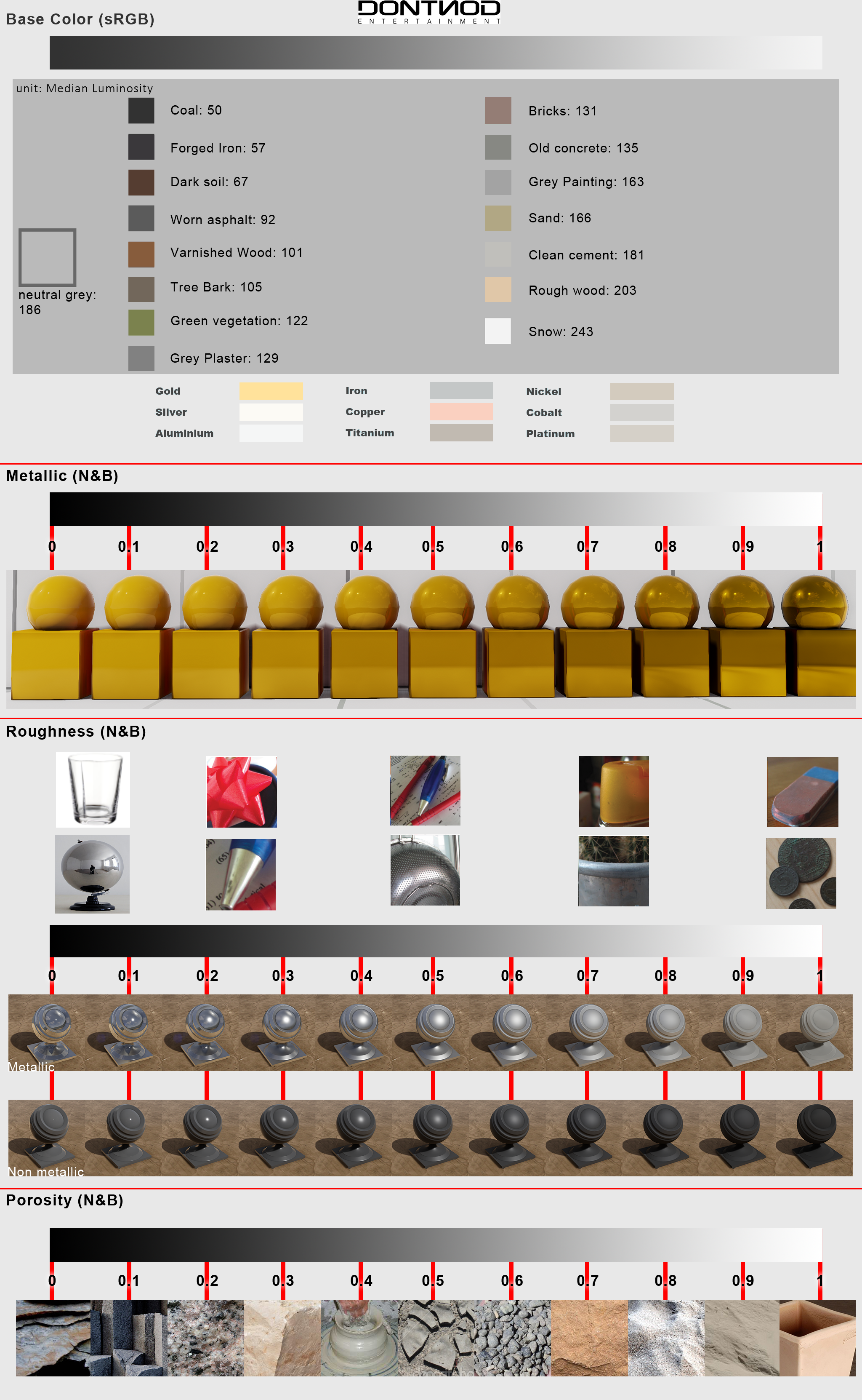
This is probably the number 1 issues I see with people new to Designer and even in quite a few professional pieces. With PBR, it is very important that the base colour values are the correct RGB value. Often when authoring you tend to look at your material in one lighting environment and do not change the setup a lot. This means you balance your material for that condition and once it’s used in other setups it doesn't work as well. This was definitely something I was guilty of myself but working with different lighting setups and time of day systems across my career has helped me to understand how important this is. The other benefit this gives you is the ability to be very creative with lighting; you can make a super dark night-time scene with hardly any natural light or a very bright daylight scene and know your materials will work great!
To ensure your material is flexible enough to work in multiple setups follow the charts linked below.
Don't Nod Chart
Adding local colour variety in diffuse/variation in roughness
Observing scan data you can see how much variety exists in your albedo map that isn’t lighting information. As I have pushed and developed my materials, I have tried to push these details and learn from scan data. Using generators as well as grunges is a great way to get this information in and have it line up nicely with your normal and height information.
Pulling back from your materials
A common issue with materials creation is creating awesome content and detail super close up but without much consideration when pulling back from the material. This often means you run into obvious tiling issues from not observing your material from a distance. Ideally, you want a material that works well from far away and close up. It’s a hard balance to get right. There are cases where putting unique detail into a material can work well such as a vertex blend that you don't see that often. Pulling back can help to identity problems and help to balance your material. Equally getting in close will ensure a good read close up. It’s good to keep in mind the use case of your material and cater for that.
Setting accurate material properties
Often when marking work I see a great deal of metallic bricks. Although reflections can help to identify details in the material it's always best to try and make your material represent the type of material it's made from.
Use blurs to add detail
This is quite counter intuitive but the example I always use is the Polycount diagram of baking. By blurring your height map a certain amount, you are allocating more pixels to the map. Similar to chamferring an edge in 3D. This is an important technique to remember when creating good normal maps
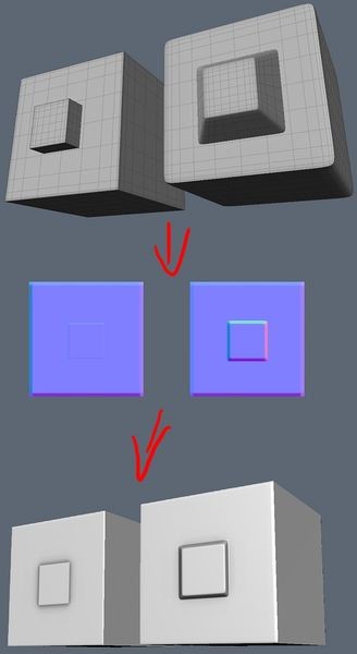
Image from Normal Map Wiki Polycount
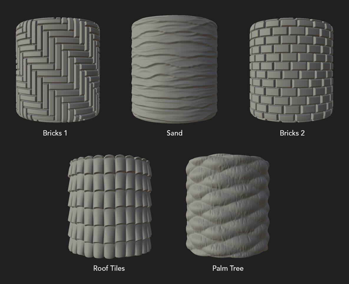
Scale vs variety
It can be hard to know the amount of bricks to put into a brick material, or the amount of sand dunes on a sand texture. I often find it is best to look at pre-existing materials and experiment yourself to find a good balance. Remember you can push higher resolution the larger the scale of your individual elements in your texture. This is a balancing act though because you want as much variety as possible. I have seen students putting double the amount of bricks in a material and although they have lots of variety the material can become muddy and low res.
It's also worth mentioning the content of your substances. I have seen many passionate and exited students wanting to create amazing work which can lead to over complicated graphs attempting to tackle too many things. Try to not create a brick with damages and plaster all in one material but instead keep it simple and break these down as separate assets.
Example of excellent scale and simple consistent material patterns, Week 1 Alina Godfrey
Thanks for reading, I hope this is useful to you. Let me know if you found it helpful and would like me to tackle more topics like this.