After the Artstation challenge I took time to reflect upon my work. From university progression developed at a steady rate. Each project I improved and learnt something to take forward into the next concept I worked on. It wasn't until finishing the challenge I hit a bit of a brick wall.
Professionally, learning has continued to improve especially with Substance. I think this is in part to do with the company I share, but also the sheer time spent in particular disciplines. With personal work I felt I underachieved in the Beyond Human Challenge. That’s not to say It was awful or horrendous and there were definitely some new lessons I took away. Bringing understanding of properly calibrated materials from work benefited the environment the most. This gave me flexibility in lighting the scene that I never had in previous projects. Yet ultimately I came out of it unsatisfied and disappointed with the end result.
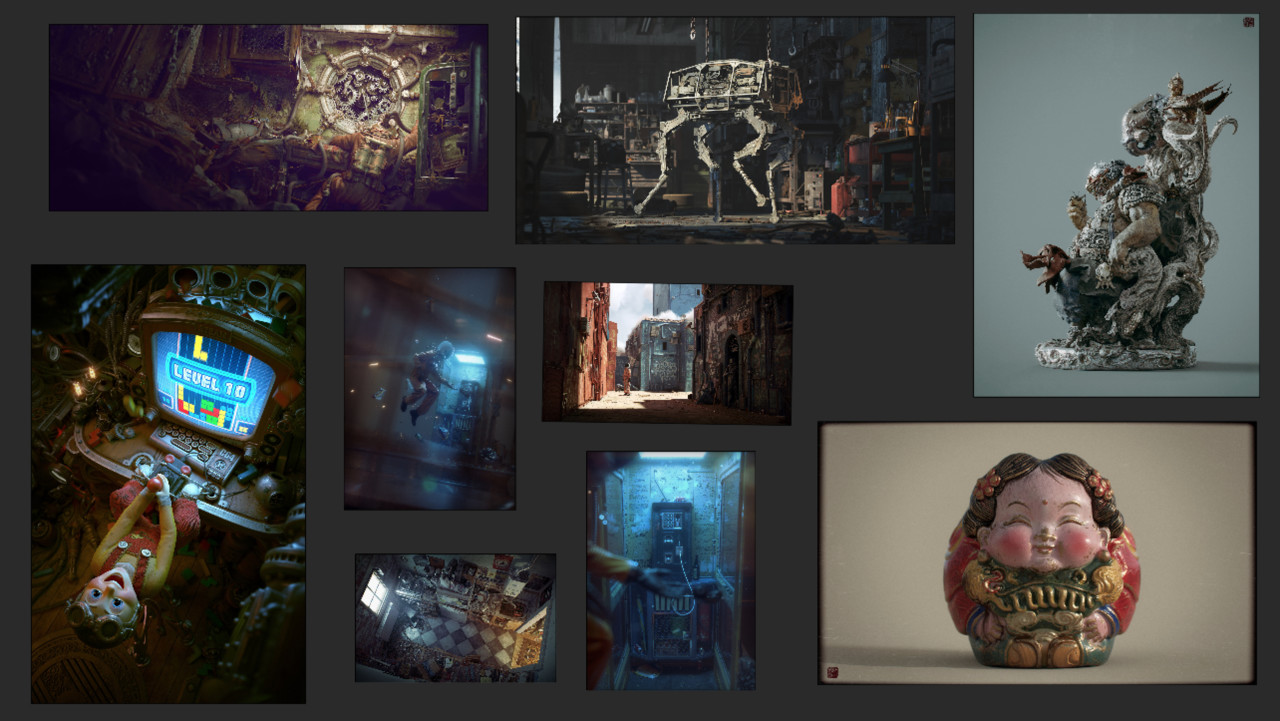
Upon reflection I drew inspiration from other artists. Looking into their work and attempting to understand what shortcomings were needed to get there. The common theme included a few ideas I noted here.
Often they used offline rendered method such as V-ray
A key focus on telling a story
Great composition made sure there was never any questions in subject.
Links to Artstation profiles. If you are interested in the above work
After outlining areas I hadn’t quite hit yet, I began thinking of new projects. Pushing through the brick wall of development is about quality as well as the shortcomings mentioned above. In the past I worked with timelines set by myself as well as project deadlines such as the challenge. Although there was a lot to gain from sticking to a predetermined schedule I have opted for a much wider timescale this time round. The advantage of this means I can work on each stage while reviewing thoroughly before I move on. I want everything I am doing to be perfection.
I began this project in the way I have previously by firstly sourcing reference images. Initially working from other artist inspiration to look into what aspects of the images I found interesting. Why was the composition so successful and how did they achieve that result? What story was it that they were trying to tell and why was that interesting? How did the rendering enhance the quality of the image and what details did they focus on?
I started focusing on different tutorials and learning resources to help gain more background knowledge on these topics. A couple of standouts for me are below.
Lenses, Composition and Camera Angles
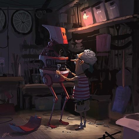
After researching further into Vray and compositional techniques I started collating images of compositions that I felt were successful and worked well. I then started to think about loose ideas of a story. I have always created quite dark and moody themes within my work in the past and to try and change things up I wanted to opt for a theme that stayed away from this. I stumbled upon Goro-Fujita’s work as I loved the storytelling he created. He has a gorgeous sense of colour and atmosphere in his work which could be likened to a pixar or disney style animated movie. I particularly loved the image below which I thought showed a strong composition and theming which would be perfect for the type of project I wanted to create.
This gave me a great starting point for my story; an old guy working on his robot to repair him. Giving me the chance to introduce lots of detail in the middle and background and show quite a homely warm atmosphere.
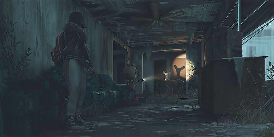
Fleshing out the story further I started to look at other images that inspire me. I have always been a huge fan of Simon Stalenhags work and I knew that he created emotive imagery often including robotics. This image stood out to me as there was a cool sense of discovery using light and shadow. I thought that perhaps I could introduce that feeling as part of my image with a smaller robot in the foreground. I was interested in playing with the feeling of an older robot discovering the newer model being created.
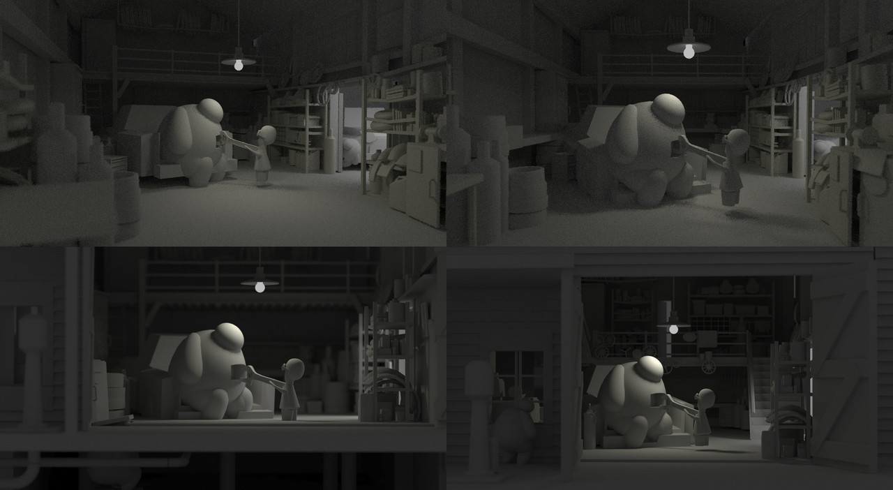
I then started to play with compositions.I treated this stage as my blockout, picking a setting and building some primitive shapes. I have been guilty in the past of picking an interesting project idea and being so excited to start that I haven’t seen the blockout process through thoroughly enough. After watching the Gnomon tutorial I picked up a couple of tips on ways to explore this process further and setup different angles. I attempted more angles than below but these were some of my favourites. In the past I never setup multiple viewpoints. Seeing them side by side allowed me to progress and take forward elements I liked from each. I never understood this before but you can't always expect the first idea you have to be the best.
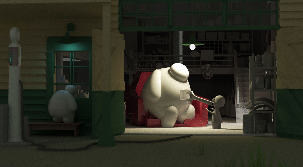
After attempting different compositions I never expected to work , this led me to create my final blockout image.
*Robot is placeholder shapes I am aware he looks like big hero 6
One thing I also did here was get lots of different advice and opinions on these compositions. Although it’s not 100% perfect I am pretty happy that this is going to make a successful image when fully realised. It is complete to a level that I can iron out a few kinks once I work further into the models. I can now comfortably move on to fleshing out props further.
I plan to update in blogs as I work on the project. Hopefully this project pushes above and beyond the quality at which my current folio sits. I would be interested in any thoughts you have and any tips you may have to offer.
Ben
