Hey Everyone,
I was out of work for a couple of months, which allowed me to spend some time working on this project. I had a lot of general props to create, so this was a great time to crank these out and focus on finishing the project.
The first asset I worked on was some vents and aircon units that would go on the top of the gas station. Games like Wolfenstein and Fallout inspired these, and some awesome high poly work was done for these games.
This is the high-poly work I did for these props. I tried to create an interesting and functional design and shape based on real references.

Here is a quick pass on the texturing for these

This vent was inspired by one of the designs from Dex Diner in Star Wars. They had a cool-shaped roof vent, but it's very hard to tell the detail as it's only in one shot in the movie. So, I took some artistic license and tried to add detail that matched the look of my vents from above. I even reused a section of the wall vent to better connect these.

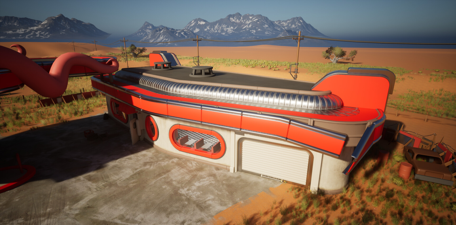
Here is how it matched the building shape in the game. I added metal trim around the edges to fit it properly with the building. I always try to find opportunities to do this to avoid meshes looking jammed together.


The oil drum was sculpted and then dynameshed down to form the geo. I added a label on top with a masked alpha to make the edges of the label.

I modelled the vents on the side with radiators inside to give depth for the ice storage. The ice font was a paid-for font I used in Painter, which saved a lot of time when texturing.

These are all pretty straightforward props. The only noteworthy points are there are quite a few modelled bits, such as screw bolts, hinges and cut-in holes on the signs. As the meshes are all nanite, I can add that extra geo but still keep the models pretty low in detail. I mostly have to think about the texel space these elements take up. My rule is that if something becomes too complex or fussy, uses too much UV space, and is under 10cm in depth, it can sometimes be easy to bake these down to a normal map. Many of these props don't use a normal; if they do, it's more material-level-based.


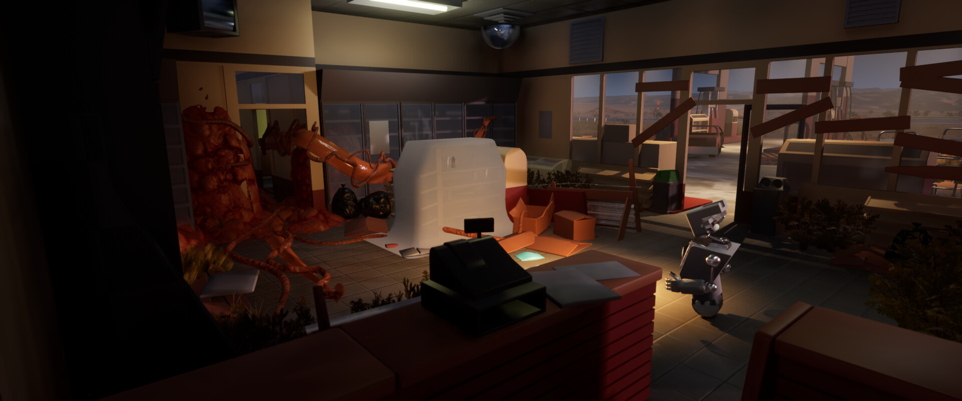
I used a combination of scans from the Megascan library and some sculpted meshes for these cardboard boxes. I reused a lot of the geo from the scan but did a clean-up pass to remove crunchy detail on the edges and then retextured them in Painter, so the meshes sat a lot better with all my hand-crafted work. This is a great example of how you can benefit from a tool like Megascans but edit the work to sit better in your art direction.

I made these two pricing signs. The pricing and signage are created as floating planes or geo on top.

For these telegraph poles, I made a couple of different modular variants. I also made a Blueprint following a tutorial allowing the cable to snap between two points. This means the poles automatically create the cables and update as you move them around. I also created other cables with gravity and weight in the scene. So, it's quite a versatile tool.

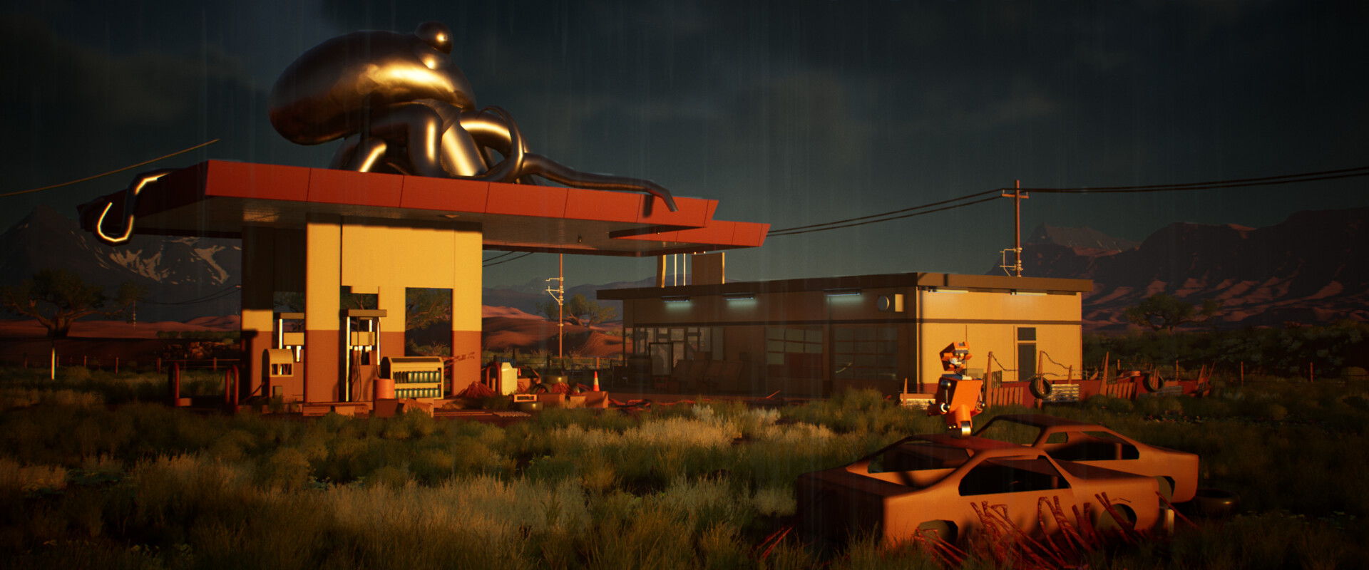
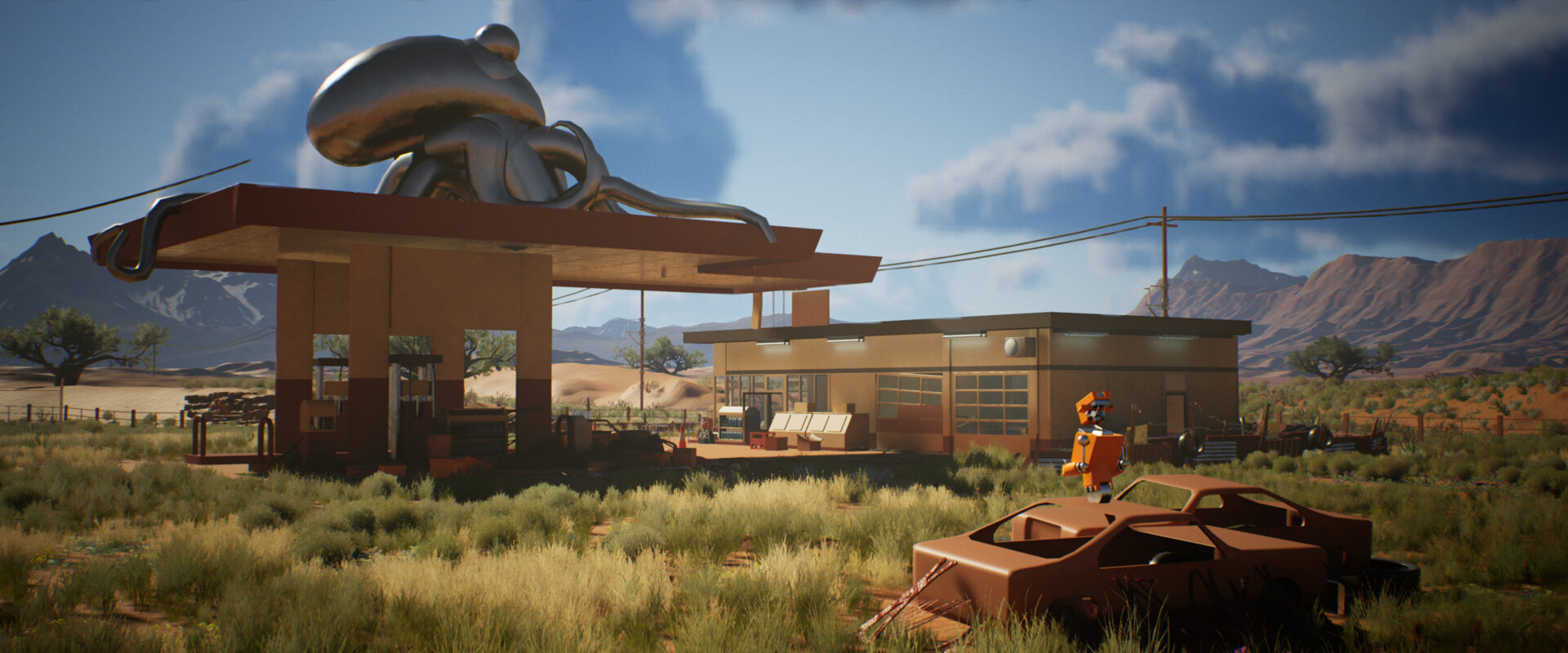
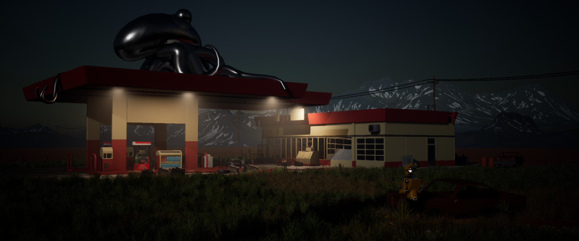
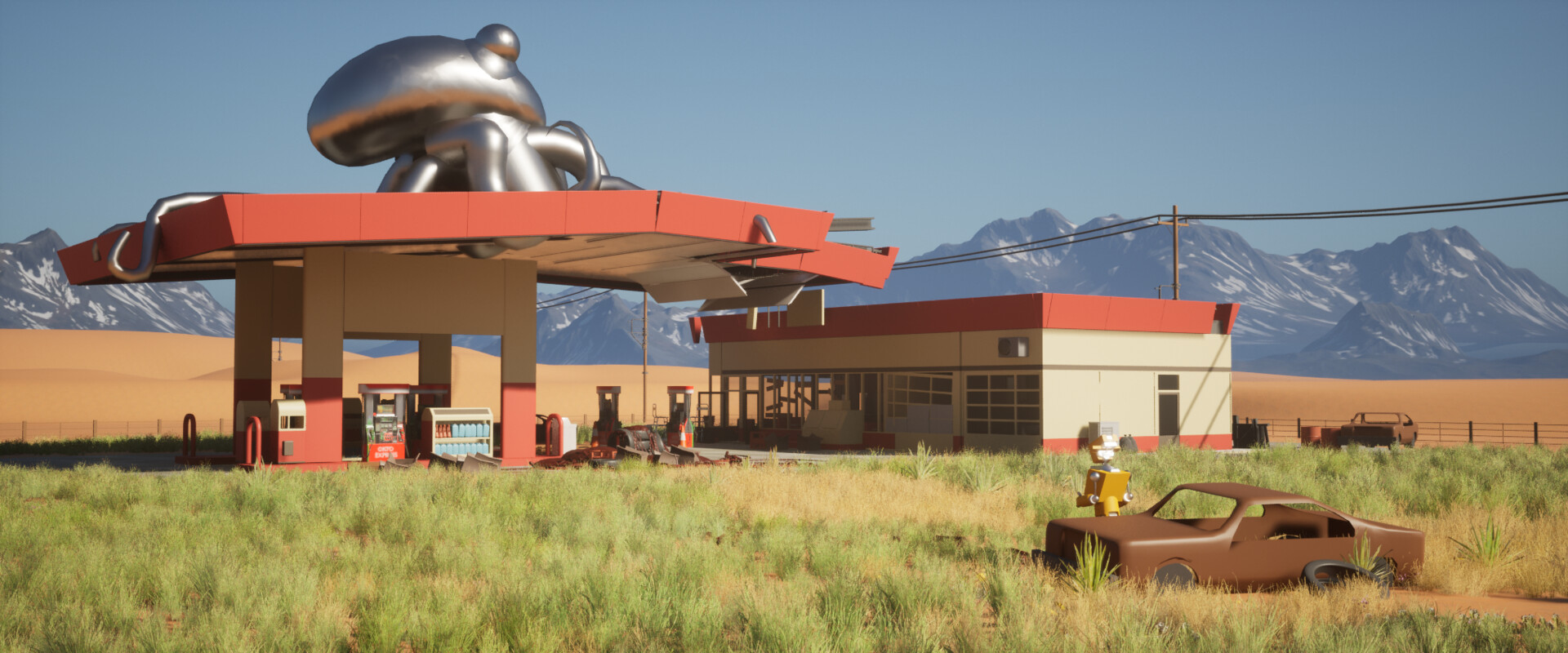
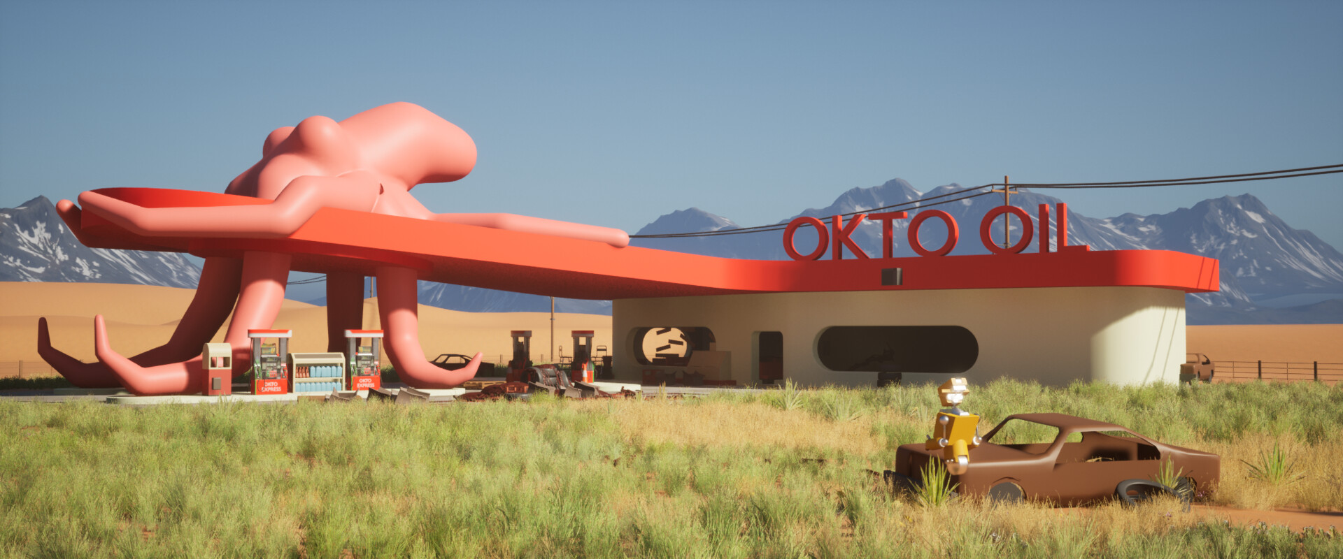
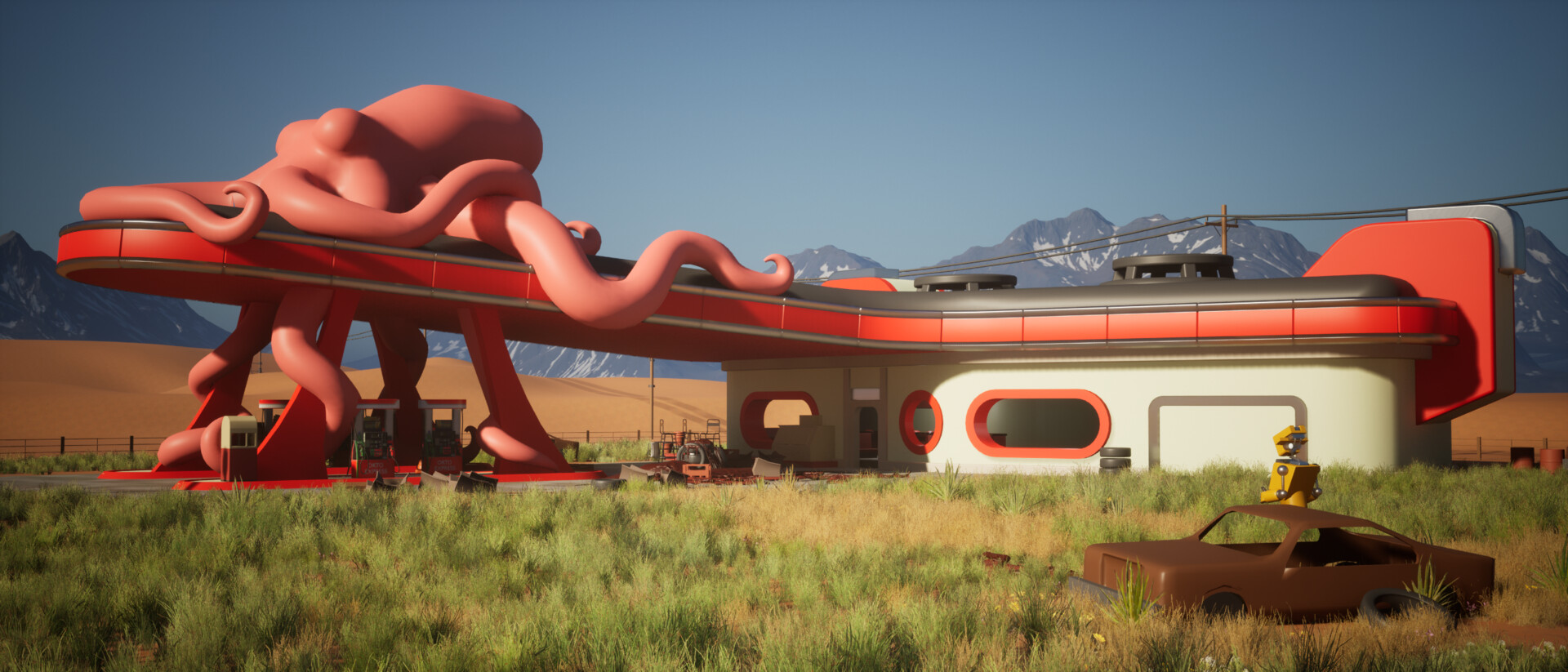
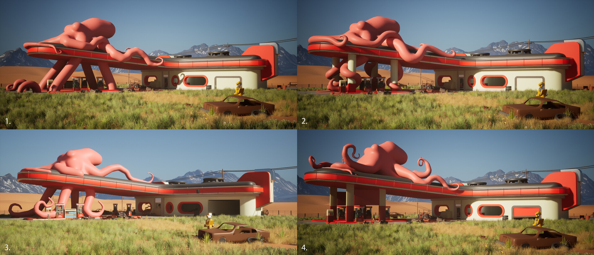
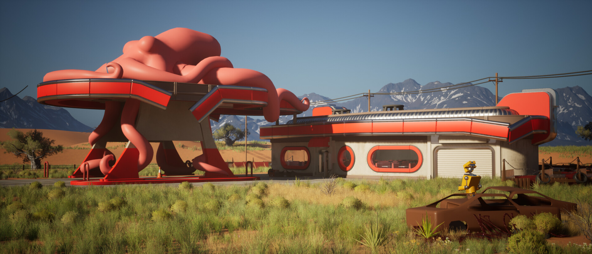
Next, I wanted to create some cars for the scene. It is a gas station, after all. I didn't want the gas station to be from any particular time period, and I have a mix of models and assets inspired by different eras. The overall style of props I was going for is soft boolean merged shapes and rounded forms. This is mainly applied to the props tied to the gas station itself. The more realistic props still have some more square and sharper shapes.
I originally tried some older cars from the 50s, namely the Ford Consul, but I found the shapes to be a little too rounded and stylised, and it felt a bit too cartoony for the scene. Ultimately, I settled on the Ford LTD, manufactured between the '60s and '80s. It still has some slight roundedness, but it's much sharper overall. I kept it faithful to the reference but adjusted it based on different designs to create a mix I felt looked good.

Here is the textured version. I also created a mask to allow the vehicle to be colour-tinted.

I also wanted to create a silhouette variant on the cars so they didn't all look like the same car when I placed them in the scene. I thought I could make a pickup-style version by reusing many of my original car parts. Also, having the colour tinting and the doors and boot being able to open would help give more variants without having to make loads of new cars.
The pickup was pretty simple. I only modelled a new back section, including the rear fenders, rear window, and tailgate. Everything else was shared from the other vehicle. This created a nice change in silhouette and allowed me to set dress props in the back of the pickup.

Finally, I worked on the door designs for the Gas station. Again, I took inspiration from many of the shapes in Wolfenstein and Fallout's original high poly work. I wanted these to have a nice, rounded, bevelled look with interesting details while still looking functional.
The entrance door was supposed to fit the space and conform to the trims underneath. I liked the idea of adding technology on the right-hand side and maybe some more vents or air conditioning above. The same was true for the garage door, except it was just a lot wider.


I settled on electrical boxes and screens for the tech, plus the air conditioning/vents, as mentioned. Much of this was referenced from real references of similar electrical boxes or switches. I made the entrance door first and then reused many of these components on the garage door. The only unique bits of the garage door are the roller door itself and the vent.
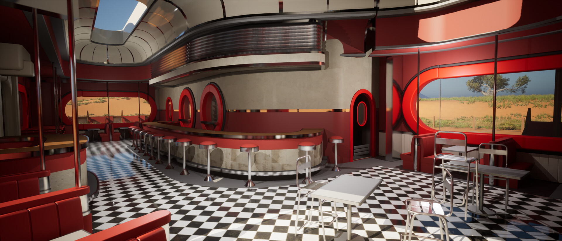
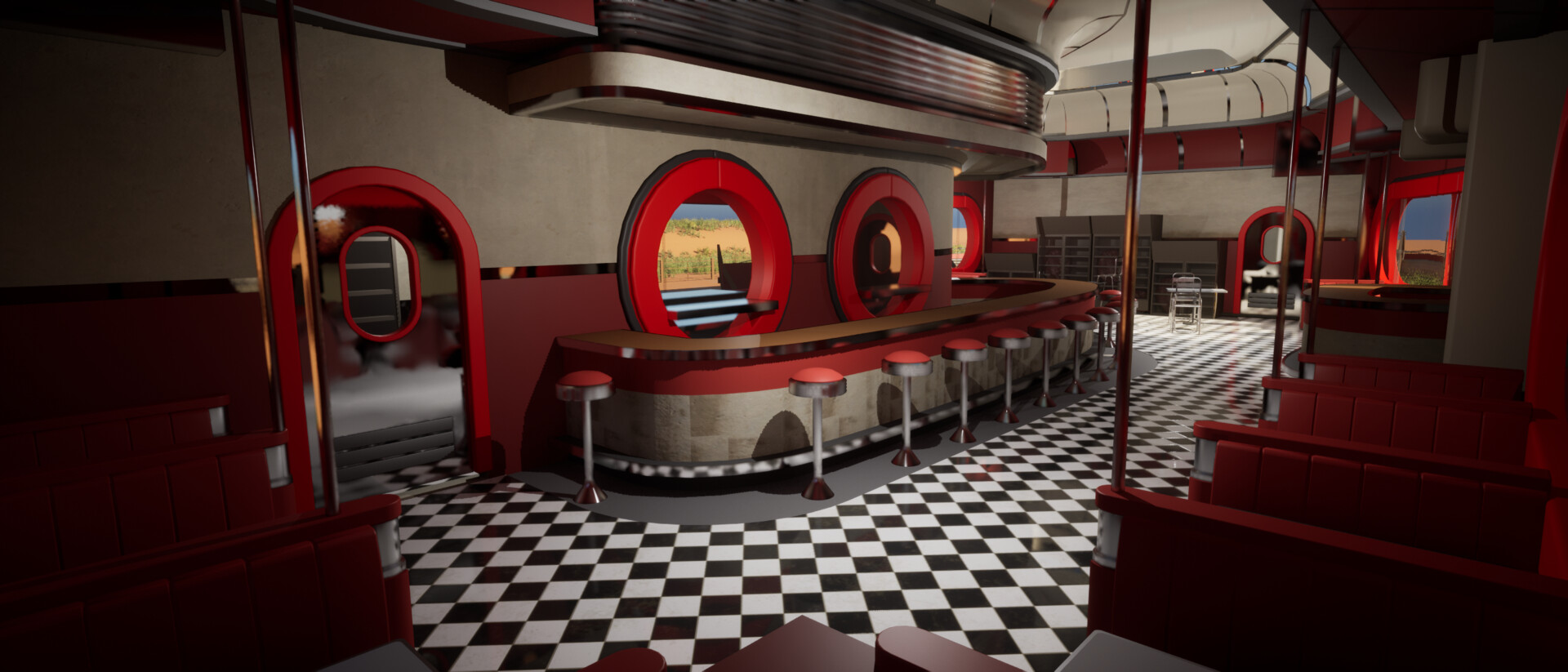
I also made a quick swinging door for the interior pictured below.


I hope you enjoyed the update
Thanks
Ben